The current look of the playlists is the same as other groups of songs on the home tab, but they may get a new look soon. The service seems to be pushing a new home page design that shows the playlists as cards with more information.
Some users have gained access to the new card that makes the home tab look more prominent, according to 9to5Google. The new design is still being tested and it is not known how widely it is available.
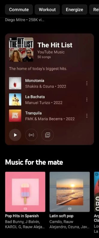
The app should now show a card in the home feed with a playlist art on the top left corner and three songs included in it. There are buttons at the bottom that allow you to play a song, start the radio, and add a song to your own list.
It will be a huge step up from the typical home screen design of tabs, in which only carousels with album art and artists are displayed It will make it easier to find songs in a song list. It can act as an example for a boring home page layout.
RECOMMENDED VIDEOS FOR YOU...
In order to compete with the best music streaming apps the service has undergone a number of changes. In order to help you discover new artists, YouTube Music has improved its song radio ranking.
A year ago, the service added a discoverability feature that recommends a mix of user-generated andcurated music at the bottom of your personal music collection.
All Rights Reserved © 2024


